Principles of Design: Creating Emphasis Through Contrast
Techniques for creating contrast in Photoshop to help emphasize your focal point.
This series of lessons were originally designed to help students create designs with more visual impact. We started by watching this short video on Emphasis.
Principles of Design: Emphasis: This is a great website with tons of cool lessons.
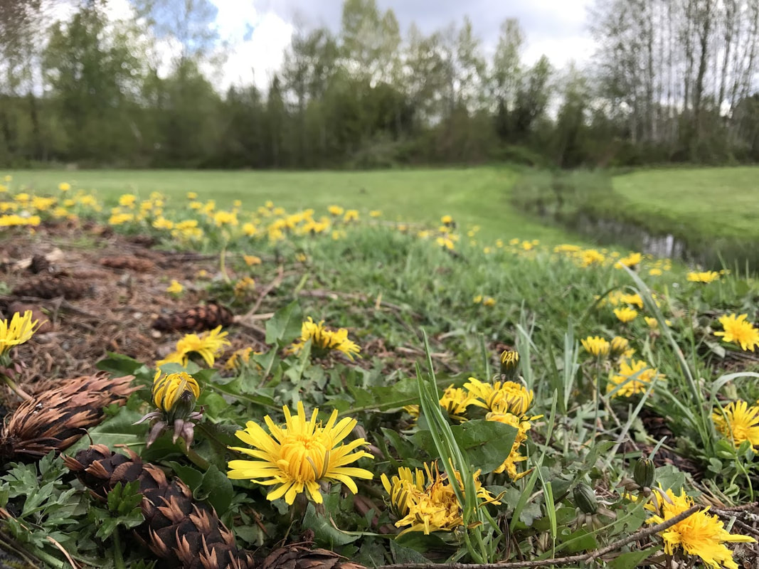
Thanks to Robbie H for providing this photo from his poster project. Sample File:
This series of lessons were originally designed to help students create designs with more visual impact. We started by watching this short video on Emphasis.
Principles of Design: Emphasis: This is a great website with tons of cool lessons.
Thanks to Robbie H for providing this photo from his poster project. Sample File:
Color Contrast - Hue
This lesson shows you how to use the Hue/Saturation adjustment layer to “Colorize” a layer. Try to use a complimentary color to your text to create maximum contrast.
Color Contrast - Black and White
This one will work great if you have a colorful title and an object in the scene that has strong color.
Focal Contrast
Many of you might have started with a photograph that has a shallow depth of field. You can use this technique to push that even farther or add it in if you didn’t start with it.
Value Contrast
This is a powerful technique that will work with almost all images.